I am writing this with great sadness in my heart because we were set to release this awesome Central Michigan t-shirt for football season but over the weekend, the MAC announced that they would not be playing football in 2020 because of health concerns for the players amidst the coronavirus pandemic.
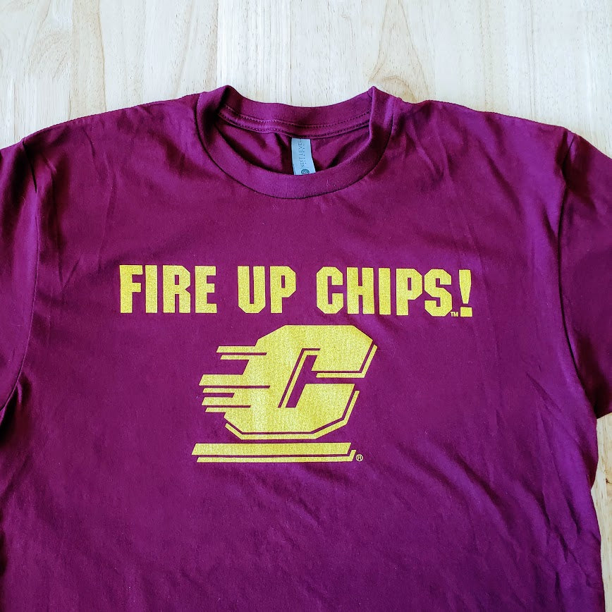
Anyway - any good CMU fan or student knows the Fire Up Chips chant at football and basketball games, so we decided to take that and put it on a shirt! It's very simple and a straightforward design, but we know that's what you all love so it makes sense, right?
A couple of notes about this shirt. We opted to put this design on a 100% cotton t-shirt instead of our traditional 60-40 cotton-polyester blend. Admittedly I was apprehensive about it because there isn't a softer or more comfortable shirt than the 60-40 blend, but the 100% cotton is still incredible. Our garment suppliers don't have as wide of a range of colors in the blended shirt, so to stay true to the CMU maroon, we selected the 100% cotton option that is right in line with Central's color palette. I wrote a blog earlier this year explaining the difference between our shirts and a 100% cotton shirt - but this garment is different from the cheap stuff that you can get anywhere. The differences are subtle but when you feel one shirt versus the other side by side, it is very noticeable. This cotton is ringspun and combed so all of the debris from the cotton plant is entirely removed, hence the feeling of softness and comfort to your fingertips. Other, cheaper t-shirts, just blend the cotton together with everything else still in it, so it isn't as comfortable and won't hold its shape over time. Check out this informational video from one of our suppliers about the difference.
Second, the pictures don't necessarily do it justice. Because the maroon is a darker color and the gold design contrasts so sharply, any photo I tried to take for this showed the garment being more purple than true maroon. I touched up the photos to the best of my very limited ability to make it appear true to the colors as possible, but it isn't perfect. So when you're perusing through the product listing and the garment color looks a little too bright or over-edited, that's because it is - and don't worry, the shirt itself is as maroon as they come.
Since we're retiring the wordmark logo on gray design (only $10 while our stock lasts, hint hint), we wanted to add another CMU design to our catalog since CMU is so close and they're such a big university in the area and in the state. There are plenty of good options; the flying C is iconic and the colors can go on almost anything. We were between this design and a few others (university seal, another wordmark style, and a few other colorful variations of those), but since our MSU Relentless shirt is so popular, we wanted to do a similar design for CMU. Athletics related, but not so athletically specific that it alienates other students or more casual fans. Like the Relentless design, the Fire Up Chips design is well known the CMU community, even exchanged on the street between alumni, and we couldn't actually find it very frequently when we did our own little shopping search for it, so we wanted to be the ones to offer it!
And of course, right when we get it printed, the MAC cancels football for 2020. The worst year in history continues to disappoint. But hopefully a new CMU shirt will make it a little bit better.
Any CMU designs you want to see? Let us know in the comments!


Leave a comment